

Graphic Screen Designer
The VIP Graphic Screen Designer is used to create and edit both custom graphical screens and template definitions. It is used to enhance the visual presentation of a graphical screen. Changes that effect screen processing logic such as data element lists, data element types, and data element attributes cannot be made from within the screen designer. Any changes that impact the screen logic must be made to the format definition or to the character screen definition. Updates to formats and character screens are also made to corresponding graphical screen definitions.
The screen designer will be automatically executed on the client from the host through Dictionary-IV screen maintenance. With VIP enabled, select Dictionary-IV then Screens. The screen definition view will be displayed. The GUI Scrn Type column will indicate if a graphical screen exists. Custom graphical data entry screens are type 3. Templates are type 4. If a graphical screen does not exist, this column will be blank.
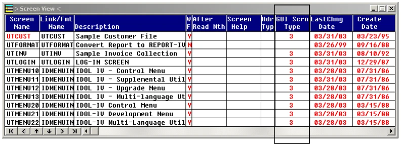
Highlight the screen or template file name (in the example above UTCUST). The options appear in the status bar.
Press F1 to edit the screen.
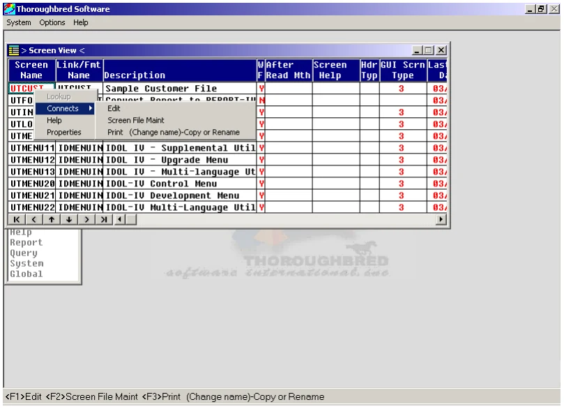
When you select Edit the following options appear in the status bar (or message dialog box).
Select G-GUI Screen.
If the graphical screen definition does not exist, the following options appear in a message dialog box or the status bar.
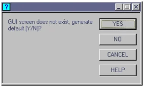
Select Yes to generate a default graphical screen. If a default template option has been set in the WorkStation Manager, that template will be applied when the default screen is generated. See WorkStation Manager (Screen Template Options tab). Templates can also be applied from within the Graphic Screen Designer; it is not necessary to set the template option in the WorkStation Manager.
The Graphic Screen Designer will be started and the graphical screen or template will be loaded.
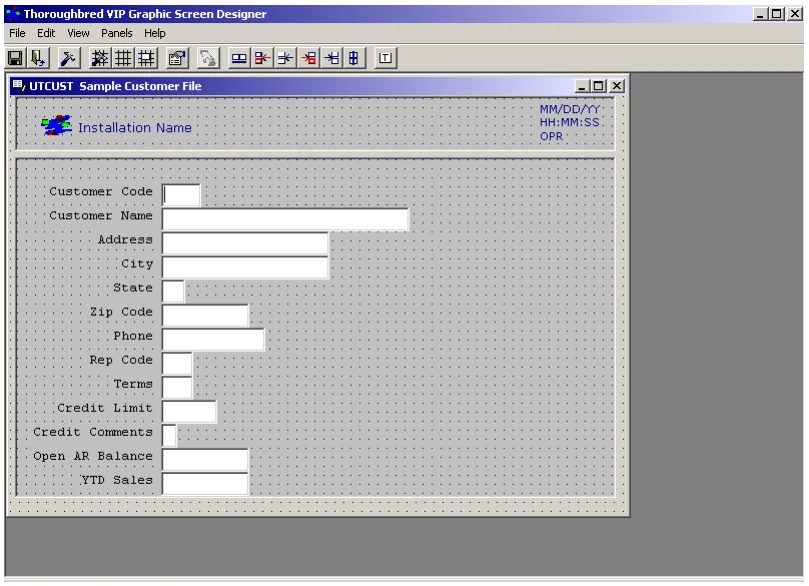
The previous screen is based on the template installed with VIP for Dictionary-IV (UTSV001).
When a graphic screen or template is loaded in the Graphic Screen Designer, the host will
remain in a “wait state.” The prompt message “Host/Screen Editor Communication in
progress…” will display while the host remains in the wait state. The communication link between the client and the host must remain open until the graphic screen or template is uploaded or unloaded from the editor. When a graphical screen is uploaded from the designer to the host, this prompt message is cleared. Only then is the host available to perform other Dictionary-IV functions. For more information see the Saving, Unloading Screens, Closing the Designer section in this manual.
Menus and Toolbar Buttons
Section titled “Menus and Toolbar Buttons”There are two buttons that do not appear in the menu option.
The Shift Down, Jump to Font button enables mouse shortcuts for control objects.
When this feature is enabled, clicking the mouse (left or right mouse button) on an object with text properties displays the font properties dialog box. Clicking on an object with no text properties (e.g.: form panels) brings up the color properties dialog box. Press the button again to disable these shortcuts.
Use this button to apply a template to the current screen. To select the template definition, see the Options (Templates) section below. A template should not be applied to a template definition, only to a custom graphical screen.
Below are the menus options and tool bar buttons (represented graphically) available in the Graphic Screen Designer.
Files
Perform one of the following:
Save Screen
Save Template
From the File menu, only one of the save options will be enabled depending upon the current screen type.
For more information on saving graphical screens see Saving, Unloading Screens, Closing the Designer in this manual.
Exit (disconnect from host and exit)
Edit Options allow you to set various preferences and options for the designer. The Options dialog contains three tabs (General, Templates, and Command Button). For more information see the Options section in this manual.
View
Perform one of the following:
Open/Close Object Tool box
Open/Close Grid Tool box
Open/Close Object Property List
For more information see Object Toolbox, Grid Tool box, and Object Property List sections in this manual.
Panel
Perform one of the following:
Add or Delete a Header Panel
When a Header Panel is added to a screen, it is placed at the top of the screen. To resize or move the Header Panel use normal Windows resizing techniques (drag edges left/right or up/down).
If a Data Panel exists, by default the width of the Header Panel will be sized to the width of the Data Panel. To enable/disable this option please see Options, Templates. A similar option is available at runtime when a template is applied to a default screen. See the WorkStation Manager manual (Screen Template Options tab).
When a panel is deleted from a screen, all controls except image controls will be moved from the panel to the screen form. Image controls must be manually moved off the panel before deleting it. Any image controls left on the panel will be deleted.
Add or Delete a Data Panel
When a Data Panel is added to a screen, it is placed at the top of the screen. To resize or move the Header Panel use normal Windows resizing techniques (drag edges left/right or up/down).
When a panel is deleted from a screen, all controls except image controls will be moved from the panel to the screen form. Image controls must be manually moved off the panel before deleting it. Any image controls left on the panel will be deleted.
Do not delete the Data Panel from a template definition. All templates must contain a Data Panel.
Add or Delete a Footer Panel
When a Footer Panel is added to a screen it is placed at the bottom of the screen or below a Data Panel. To resize or move the Header Panel use normal Windows resizing techniques (drag edges left/right or up/down).
If a Data Panel exists, by default the width of the Footer Panel will be sized to the width of the Data Panel. To enable/disable this option please see Options, Templates. A similar option is available at run time when a template is applied to a default screen. See the WorkStation Manager manual (Screen Template Options tab).
When a panel is deleted from a screen, all controls except image controls will be moved from the panel to the screen form. Image controls must be manually moved off the panel before deleting it. Any image controls left on the panel will be deleted.
Help
Use this menu to view Online, Technical Support, and About help.
Options
Section titled “Options”The Options selection opens the following window with three tabs: General, Template, and Command Buttons.
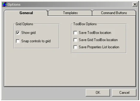
General Tab
Section titled “General Tab”Show grid
Displays a grid on the screen.
Snap controls to grid
Enable and disable the Snap To Grid.
Save Toolbox location
The Object Toolbox will open at the location where it was last closed.
Save Grid Toolbox location
The Grid Toolbox will open at the location where it was last closed.
Save Properties List location
The Properties List will open at the location where it was last closed.
Templates Tab
Section titled “Templates Tab”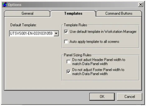
Default Template This drop-down list box allows you to select a template that can be applied to screen definitions in the Graphic Screen Designer. This enables you to specify a different template from the one specified in the WorkStation Manager. The installed default is shown above. Only template definitions cached on the client will be available for selection. To cache a template definition, load that template in the screen designer from Dictionary-IV screen maintenance.
Use default template in the WorkStation Manager When selected, the editor will use the default template that has been specified in the WorkStation Manager.
Auto apply template to all screens When enabled, the default template will be applied to all screens when they are loaded in the editor. If this is not enabled, a template will only be applied when the apply template button is pressed.
Do not adjust Header Panel width to match Data Panel width
When a Header Panel is added, it will not be auto sized to the width of the Data Panel.
Do not adjust Footer Panel width to match Data Panel width
When a Footer Panel is added, it will not be auto sized to the width of the Data Panel.
Command Buttons Tab
Section titled “Command Buttons Tab”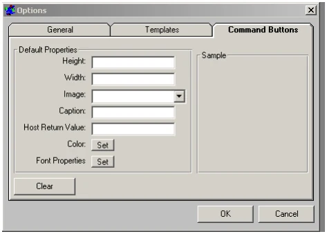
The dialog allows you define the default properties to be used when creating new command button controls.
Command Button Default Properties It is possible to set default properties to be applied to a Command Button when it is first created. If an entry does not have a value, it is ignored. You can specify any or none of the default properties (Height, Width, Image, Caption, Host Return Value, Color, and Font).
Example Command Button Entries
cmdbuttbackcolor=&H00C0C0C0This entry allows you to specify the background color of the Command Button. This must be hex notation. The default background color is the system default color in the user’s preferences specified in the system desktop appearance setting.
cmdbuttcaption=my buttonThis entry allows you to specify the button caption.
cmdbuttheight=750This entry allows you to specify the button height.
cmdbuttwidth=750This entry allows you to specify the button width.
cmdbuttimage=tsi.icoThis entry allows you to specify the image (picture property). The image file must be located in vip-data-path/Tsi/Image folder.
cmdbuttfontname=ArialThis entry allows you to specify the font name for the caption.
cmdbuttfontsize=8This entry allows you to specify the font size for the caption.
cmdbuttfontbold=TThis entry allows you to specify the font bold property, T (true) for bold and F (false) for regular.
cmdbuttfontitalic=TThis entry allows you to specify the font italic property, T (true) for italic and F (false) for regular.
cmdbutthostrv={F9}This entry allows you to specify the Host Return Values. These must be entered exactly as you would from within the Graphic Screen Designer.
| The following | table | contains valid | values for | the Background | property: |
|---|---|---|---|---|---|
| Light | Darkest | ||||
| White | Gray | Gray | Dark Gray | Gray | Black |
| FFFFFF | E0E0E0 | C0C0C0 | 808080 | 404040 | 000000 |
| Lightest | Darkest | |||
|---|---|---|---|---|
| Light Red | Red | Dark Red | ||
| Red | Red | |||
| C0C0FF | 8080FF | 0000FF | 0000C0 | 000080 |
| Lightest | Light | Yellow | Dark | Darkest |
| Yellow | Yellow | Yellow | Yellow | |
| C0FFFF | 80FFFF | 40FFFF | 40C0C0 | 408080 |
| Lightest | Light | Green | Dark | Darkest |
| Green | Green | Green | Green | |
| C0FFC0 | 80FF80 | 40FF00 | 40C000 | 408000 |
| Lightest | Light | Cyan | Dark | Darkest |
| Cyan | Cyan | Cyan | Cyan | |
| FFFFC0 | FFFF80 | FFFF00 | C0C000 | 808000 |
Lightest Darkest
- Light Blue Blue
- Dark Blue
- Blue
- Blue
- FFC0C0
- FF8080 FF0000 C00000 800000
Toolboxes
Section titled “Toolboxes”Object Toolbox
Section titled “Object Toolbox”The Object Toolbox is used to add and delete controls on the screen from.
Select the Object Toolbox from the View option on the menu bar, or select the Object Toolbox button from the toolbar.
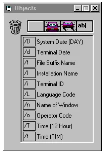
From the Object Toolbox you can drag and drop buttons, images, text, or any of the listed Dictionary-IV special characters. Once added, you can use Object Properties to set the attributes of the objects (see Object properties later in this manual).
- Delete Objects
-
Trashcan

One of the first items you will see is the trashcan. Drag and drop objects you want to delete into the trashcan. When editing templates, you cannot delete the “Description” label, the “Data” control, or the “Formula” control. These are required on all templates.
- Add Buttons, Images, and Text
-
Command Button Drag and drop this button to any position on the screen. From the Object Properties List you can set the properties for this command button.
Fixed Image

Drag and drop this button to any position on the screen. From the Object Properties List select the image attribute. The image screen appears. You can select an icon (.ico) or a bitmap (.bmp or .dib) image. You can resize and crop the image container control. Resize the image by grabbing a side and stretching it. This will not resize the image, only the image container.
Resizable Image

Drag and drop this button to any position on the screen. From the Object Properties List select the image attribute. The image screen appears. You can select an icon (.ico) or a bitmap (.bmp or .dib) image. After you select an image, you can resize it by grabbing a corner and stretching. This maintains the aspect ratio (resizes proportionally).
Text
Drag and drop this button to any position on the screen to add text. Use the Object Properties list to define any of the properties (such as color and font) associated with text objects.
Special Screen Codes
The Object Toolbox allows you to select the Dictionary-IV special screen codes and place them on your graphic screen:
- /D
- System Date (Thoroughbred Basic directive DAY)
- /d
- Terminal Date
- /f
- File Suffix Name
- /I
- Installation Name
- /I
- Terminal ID
- /L
- Language Code
- /n
- Name of Window
- /ο
- Operator Code
- /T
- Time (12 Hour)
- /t
- Time (Thoroughbred Basic directive TIM)
Select a special screen code. Drag it to the appropriate position on the screen and drop it. Select the Properties List to define the attributes of the special screen code.
The current host values for special screen codes (i.e. /D, /I etc.) are not displayed while editing a screen. Descriptive text is used for the special screen codes. At runtime, the descriptive text is replaced with the current host value. This text is maintained in the workstation message file. For more information on editing the message file see the Multi-Language for VIP manual.
Grid Tool
Section titled “Grid Tool”Select the Grid Tool option from the View menu. The system displays the following:
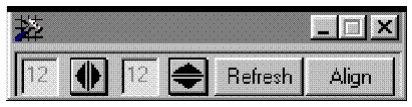
From this tool you can select the horizontal and vertical size of the grid (measured in pixels).
- You can also Refresh
- the grid and Align objects to the grid.
MenuBar Buttons
Section titled “MenuBar Buttons”You can select multiple controls by holding the Control key while selecting the controls.
Y-axis align: Aligns selected controls along the Y axis, position all controls based on the bottom most control
X-axis align: Left align selected controls along the X axis, position all controls based on the position of the first selected control.
X-axis align: Left align selected controls along the X axis, position all controls based on the position of the left most control.
X-axis align: Right align selected controls along the X axis, position all controls based on the position of the first selected control.
X-axis align: Right align selected controls along the X axis, position all controls based on the position of the right most control.
X-axis align: Center align selected controls along the X axis.
Object Property List
Section titled “Object Property List”The Object Properties list provides you with a method of viewing and setting optional properties for objects on the graphic screen. Select the Object Property List option from the View menu or click on the Object Property List button on the menu bar. Select the text “Customer Code” and the property listing for the textbox control (label) appears. See below.
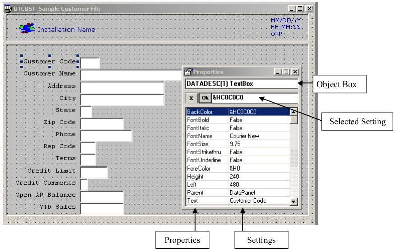
The attributes are a function of the object. The content of the box varies with the type of object. The Properties List is designed in a Visual Basic style.
Object Box
Contains the name of the object for which you can set properties. In the example above DATADESC(1) Text Box. The object name cannot be changed.
Property List
Displays all of the properties for the screen object. The right column displays the current settings for each property. In the example above it is the BackColor and the color code &HCOCOCO, which is highlighted.
Setting Box
Lets you edit the settings for the property you select in the property list. To save a change made to a property in the setting box, click the Ok button. To cancel a change made to a property click the X button or click on another property in the property list.
- Color Settings - In the example above double-click on &HCOCOCO in the Setting Box. The Windows color dialog displays where you can select a different color.
- Font Settings - If you move the selection in the properties list to FontName Courier New and double-click on Courier New, the Windows font dialog displays, where you can change the font and its properties.
- True/False Settings – If you move the selection in the properties list to FontBold False, you can use the arrow to select True.
- Input Settings – If you highlight Text Customer Code, you can type over “Customer Code” to change the text in the window. The same holds true for Height, Width, Left, etc.
- Image/Button Settings – Use the same method to select properties for images. For information about adding actions to images or buttons, see the following section.
Adding Actions to Images or Command Buttons
Section titled “Adding Actions to Images or Command Buttons”- Select the image or command button from the Object Toolbox
- .
Drag and drop it on the graphic screen or template. Open the Properties List and select the image and the following window opens.
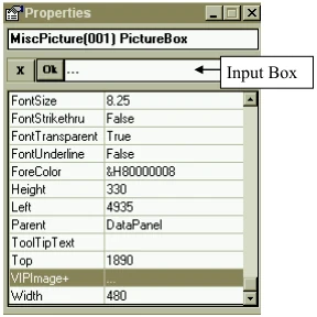
Input Box
Double-click on the input box to display VIPImage+. Images you want to use should be stored in the vip-data-path \image directory. In the example below, the Tbred.ico file was selected; however, many image file types are supported.
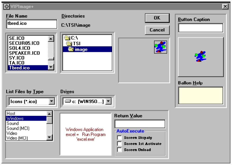
File Name
Select the graphic from the vip-data-path \image folder.
List Files by Type
Select the graphic file type you are looking for (bmp, dib, ico, etc.).
Button Caption
Allows you to display text with your image or button.
Balloon Help
Allows you to display help when the cursor passes over the image or button.
At the bottom of the window you will find the following.
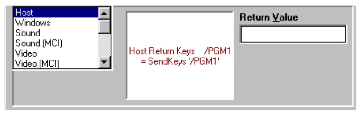
From here you can set the action for the image or command button. For more information see Toolbar Maintenance in the WorkStation Manager manual. You can set the action to take place when the Screen Displays, Screen first Activates, or when the Screen Unloads.
When a graphical screen definition is loaded and it contains an image control that references a missing image file, the image control is not visible. The image control itself has no visible properties; only the picture contained by the control is rendered. Consequently, an empty image control is enabled but it is not visible.
To help locate and identify an image control with an invalid image file name, a warning message will be displayed. This message displays the name of the missing image file and gives you two options:
OK to set image name to missingimagefile.bmp. Selecting this option will update the image control setting the image file to missingimagefile.bmp. This image is similar to the image used when an image control is first added to a screen. By replacing the invalid image file with a valid one, the image control is visible and can be easily corrected. If the screen definition is saved, it will be saved with missingimagefile.bmp
Cancel to load the empty image control. Selecting this option will load the image control but it will not be visible. missingimagefile.bmp is displayed so that the control is visible but is not saved with the definition.
OK
Select the OK button on the VIP Image+ screen to save your edits.
Cancel
Select the Cancel button on the VIP Image+ screen to exit the widow without saving your edits.
Saving, Unloading Screens, Closing the Designer
Section titled “Saving, Unloading Screens, Closing the Designer”To save a custom graphical screen or template back to the host, select one of the following save options:
- From File select Save Screen or Save Template
- From the menu bar click the Save button
- From the menu bar click the Exit button. This option will also close the Graphic Screen Designer.
- On the graphical screen from, click the close button (X) in the upper right corner of the screen form.
- Click the close button (X) in the upper right corner of the Graphic Screen Designer window. This option will also close the Graphic Screen Designer.
The following message dialog will display:
Save Changes to screen screen-name?Select Yes to save the changes and upload the custom graphical screen or template to the host.
Select No to unload the graphical screen or template without saving the changes.
Select Cancel to continue editing the graphical screen or template.
If one of the options to close the screen designer has not been selected the focus will be set to the main VIP GUI Server window and the designer will display the following message in the screen designer status bar:
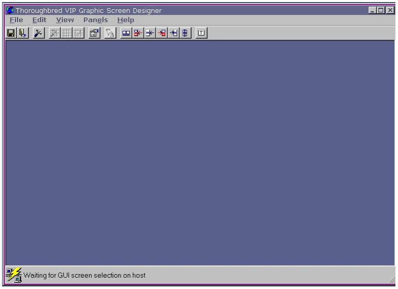
While this status message is displayed, another graphical screen or template can be selected for editing on the host using Dictionary-IV screen maintenance. This eliminates the need for the Graphic Screen Designer to be loaded each time a graphical screen or template is selected for editing.
The designer can be closed at any time by clicking on the close button (X) in the upper right corner of the main Graphic Screen Designer window.
From the VIP for Dictionary-IV Reference, version 8.9.1. Open this page in the PDF