

Toolbar
When you create a toolbar two files are created on the workstation:
- A toolbar definition file with a .def extension.
- An image file with a .bmp extension.
These are stored in the vip-data-path\Tsi\ToolBar\WsnMgr folder.
All images used by the toolbars must be stored in the vip-data-path\Tsi\ToolBar folder.
Toolbar Position
Section titled “Toolbar Position”You can select one of the following positions for the toolbar: None, Floating, Top (of desktop), Bottom (of desktop), Left (side of desktop), or Right (side of desktop). For more information see the WorkStation Manager tab.
Load New Toolbar
Section titled “Load New Toolbar”The system displays the following dialog box:
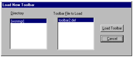
You can select a toolbar from a collection of toolbars you have previously created. For more information see Toolbar Maintenance.
Toolbar Maintenance
Section titled “Toolbar Maintenance”Thoroughbred provides toolbars that can be easily customized.
Select Toolbar Maintenance from the Toolbars option. The system displays the Configure Toolbars window.
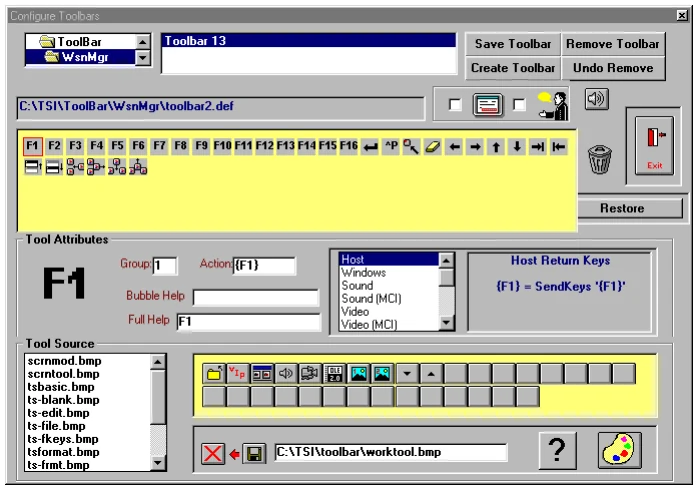
Enable/Disable selected toolbar (see selection on the left)
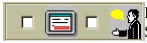
Select the toolbar you wish to enable/disable from the top of the Configure Toolbars window. Place a check in the box to enable; remove the check from the box to disable. Enable/Disable bubble help (selection on the right)
Select the toolbar for which you wish to enable/disable
bubble help. Place a check in the box to enable; remove the check from the box to disable. If you enable bubble help, moving the cursor over the toolbar button displays help. Enter the help in the Bubble Help field. For more information see Tool Attributes.
Audio configuration
If your audio configuration is correct, this option plays an audio file.
Exit

Exits the Configure Toolbar window.
Restore default settings
Select this button to restore the default settings for all the
toolbars.
Remove a button from a toolbar


Select a button from the defined toolbar to delete. Drag the button to the trashcan and drop it.
Scroll through the Tool Source and select a file. The available buttons display to the right of the Tool Source listing.
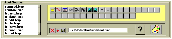
You can drag and drop the button icons into the currently selected toolbar. If you want to choose a single icon file from another path, select the Get Button Bitmap icon.
The button displays on the left. When you find the icon you want, drag it to the current toolbar listing and drop it anywhere.
Set the Tool Attributes for this button. For more information see Set Tool Attributes.
Edit an Icon
Section titled “Edit an Icon”Select a button from the current toolbar (displayed above). Select the Paintbrush icon.

The system displays the Paintbrush screen and the icon you selected, set to the default button size of 18 pixels wide x 17 pixels high.
Select Zoom In from the View menu. You can edit this icon pixel by pixel. When the edit is complete, select Zoom Out from the View menu. Select Save As from the File menu. Type the path and new file name, then select OK. From the File menu select Exit.
Drag the new icon to the currently selected toolbar and drop it. Set the Tool Attributes. For more information see Set Tool Attributes.
Create an Icon
Section titled “Create an Icon”Select the Paintbrush icon. The system displays the Paintbrush screen.

You can create an icon by creating a completely new file or by editing an existing file using the Paintbrush icon. Note: Paintbrush will create an icon in the default size of 19 pixels wide by 18 pixels high.
To create a completely new icon, drag a blank button

and drop it onto the Paintbrush icon. Create and save your file in the appropriate path.
To create an icon by editing an existing file, select the button to edit
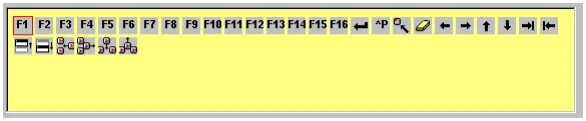
and select the Paintbrush icon. Edit the file and Save As the new file name in the appropriate path.
Place the icon in the Toolbar.
Once you create the new icon, select the following button:
and type in the location of the new icon.
Select the toolbar in which to place the new icon. Drag the new icon to the selected toolbar.
Set Tool Attributes for Buttons
Section titled “Set Tool Attributes for Buttons”Once you select or create an icon you can then define the attributes. Select and set the Tool Attributes for the button.

You can set the following attributes:
Group Group this button with others of the same number. You can define the group numbers to place the buttons in any order you decide.
Action Allows you to play any Windows audio file (.wav), play any Windows Audio/Video file (.avi), or display an image (.bmp or .dib). You can assign any script, report, query, or menu to a button by simply sending the relevant Host Return Keys. You can also execute any Windows application from this box.
Bubble Help Add the text for enabled bubble help. Bubble Help displays when the cursor passes over the button.
Full Help Add the text for the help to appear as bubble help when the mouse passes over the button. This text will appear only if bubble help is not specified.
Host Return Key
H sends the host keystrokes. To indicate the “shift key” use a + and to indicate the control key, use a ^.
For example:
H={F1} sends the F1 function key.
H=+{F1} sends the F13 function key.
H=^P sends the CTL+P.
You can use H={F1} through {F12} to represent the F1 through F12 function keys.
To go beyond F12 you need the shift key represented by using the +. You can use H=+{F1} through +{F12} to represent F13 through F24.
Other Host Return Keys (H=)
{ENTER}
^P
^Z
{HOME}
{LEFT}
{RIGHT}
{UP}
{DOWN}
{TAB}
+{TAB}
{PGUP}
{PGDN}
{DELETE}
{INSERT}
+{DELETE}
+{INSERT}
{ESCAPE}
You can also use combinations. For example,
Hello{ENTER}From the WorkStation Manager, version 8.9.1. Open this page in the PDF